I just finished season two of The Gentlemen, and before that I went back and rewatched season one. I wasn't watching for the plot — I've seen enough Guy Ritchie capers to know how those story beats land. I was watching the frames.
What I kept coming back to wasn't camera movement or lens choice. It's how much of the storytelling is carried by three things that aren't cinematography at all: color, wardrobe, and set dressing. And the deeper lesson underneath it — that when the script is sharp and the acting is great, the smartest thing the camera can do is get out of the way.
The Color
Ritchie's London feels specific. The grade leans warm and saturated in a way that flatters the world rather than disturbing it. It isn't graded like a thriller, where muted blues and desaturated greens keep you uneasy. It's graded like a place you'd actually want to be in — even when the people in it are dangerous. That's a deliberate choice. Color sets the tone before anyone says a word.
That has always stuck with me. On PADRE PIO I lit almost nothing — the candlelight, the stone, the golden hour did the heavy lifting, because the location already meant something. The Gentlemen does the same thing at a much higher polish. The palette isn't decoration. It's part of the pitch.
Wardrobe Tells You Who These People Are
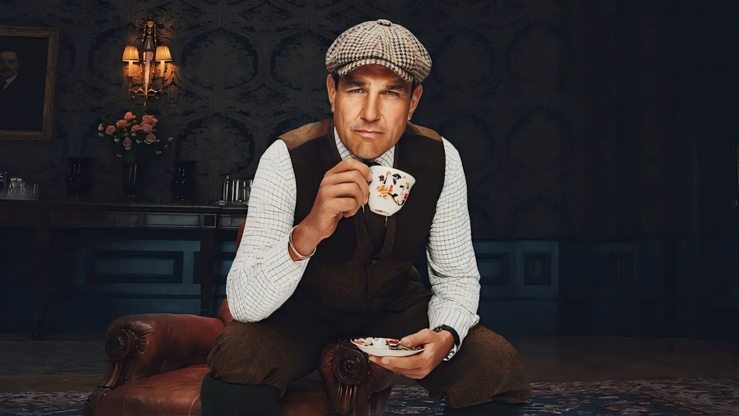
The whole show is named after how the characters dress. Class is written into the costumes before anyone opens their mouth. You can read a character's status, their ambition, their fall, from what they're wearing. As a DP, that matters enormously, because wardrobe and lighting are a collaboration. You light for the fabric, the cut, the way a coat catches a practical. If you don't pay attention to what the actor is wearing, you light blind.
Set Dressing Is Backstory
Halstead, the country estate, with its mismatched rooms and space that carries history — the setting does the storyteller's work before the dialogue arrives. It's the same principle from all my documentary work: you don't manufacture atmosphere in a place that already has it. You frame it and get out of its way.
The Real Lesson: Going Back to Basics
Ritchie's style looks effortless, but it's built on discipline — simple, clean frames, a camera that knows exactly when to stop moving. Because the script is good and the actors are great, there's no pressure on the image to perform tricks. It just has to be true.
That's the biggest thing it reminded me of. Flashy cinematography usually means the foundation is weak — the camera only waves around and calls attention to itself when the story underneath isn't holding. When the script and the acting are solid, going back to basics isn't a fallback. It's the whole job. Creativity isn't always about what you add; sometimes it's about knowing exactly what to leave out.
The Gentlemen streams on Netflix — season one and two, with a third on the way. Watch it for the craft, not the plot. Watch what the frames are doing, and how little they're doing. That's the part worth studying.
— Michael Franceschini